Friday, December 29, 2006

Winter Light/Afternoon/Drake Hotel

The office has gotten very still. It’s Friday afternoon. It’s been quiet all week. Outside my window the Drake Hotel is in the warm glow of the setting sun. ...or the Drake IS a warm glow outside my window.

The Drake Hotel in Philadelphia

The Drake Hotel


I am bothered by the flatness of Philadelphia. I have this little ache in my chest as I think of walking the Miwok and Mt Tam's trails just north of SF. These trails amble and wind over grassy hills high above the coast with a solid nonstop view of the Pacific.


View from Pop O'Rourke's bench on Mt Tam

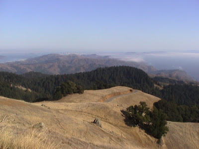
View down the coast from Mt Tam.


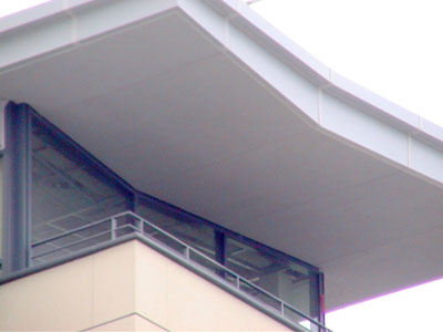
But SF doesn’t have buildings like the Drake. I see this building and I think someone must have asked for a whole landscape on top of this building to make up for the Delaware valley flats. SF has, more or less, a cranky pile of flat topped modern buildings downtown. Philadelphia's downtown buildings have much more magic in them.

I can imagine myself anywhere up on this building; sitting on terraces, lounging under arches, reading by windows.

The sun is about set. Time to wrap up here and head home.

As I finish this it has gotten darker. Looking to the west the sky is fuchsia with orange contrails darting down to the horizon. The Drake has disappeared into the dark.

Saturday, December 02, 2006

Butterfly Roof

Butterfly roofs are hard to do well. The best I’ve seen is on the UCSF, Mission Bay Student Housing.

UCSF butterfly roof
It’s subtle but there is a lot going on here that makes most other butterfly roofs look like blunt interpretations of the definition. Try a google search and you’ll see what I mean. Here the angle is not too great. The tapering thickness refined. There’s just enough asymmetry between one wing and the other to make it interesting. Most butterfly roofs I’ve seen are either so thick or so balanced that they lose any dynamic. Many simply look like the lid of an old trunk flipped up.


Props to Fisher Friedman Associates
who worked on this in partnership with Skidmore Owings & Merrill (I won’t link to SOM website. The UI is unnavigable. The search functionality too problematic) Butterfly roof

I would love to know who the individual was that did this. Buried in the team credits there must be one person who lent their own personal sense of proportion and balance to this.

The construction pic is taken from my TV. The roof - in fabrication - showed up amazingly in an episode of Monk (Mr. MONK CAN'T SEE A THING (#501) EPISODE PREMIERE: July 28, 2006)


butterfly roof on monk
That’s Captain Leland Stottlemeyer on the left.


The butterfly roof is also part of a very nice larger composition. The designers have created an occupiable space at the top of the building. This old school idea has been dropped from most modern buildings. Rather than terminate in a crisp scale-less sheet of framed glass the designers created a bit of something for the imagination at the top - a place at the top of a building where your eye can rest and wonder what it would be like to be up there. Classical buildings often give me something up top to fantasize about: wondrous views and glamorous people who wander high up on terraces outside glorious and warm rooms. It gives a building some magic. It’s cool that a modern building in the 21st century should pull this out of the bag.

Monday, November 13, 2006

LEED Home (Residential): Party like it's 1975?

The USGBC will soon release LEED guidelines for homes. Right now the focus of certification is on commercial buildings. I'm a LEED AP and I support what the USGBC is doing but I have a thought on the new LEED Home (residential) guidelines.

I think the USGBC should give you 2 different tracks towards LEED certification for the home;
A. the elaborate series of points they will come up with, or B, You can achieve LEED Platinum simply by designing your home to conform to the average size of a home from 1975. Drop any energy saving requirement. Forget water efficient landscaping. Just build less even if it’s a mess in so many ways.

The average home of 1975 was 33% SMALLER than the average home of 2005. In 1975 59% of the homes had 1.5 bathrooms or more compared with 96% in 2005. It makes me think, could the Master Bath be what is killing the planet, not the heat island on the roof?


I'm thinking of the Graphic below culled from the SF Gate article entitled, “Americans like supersized homes- Families and plots are smaller, but people want more bedrooms, bathrooms and garage space”, which in turn was partly culled from Washington Post and a graphic by Marianne Seregi.


Graphic from Washington Post by Marianne Seregi


I am guessing that the home now is so bloated compared to what we built in 1975 that for everything the USGBC will accomplish with their new residential LEED certification standards, they’d accomplish more just throwing in the towel and saying,

“Look, just build it like you would have in ’75. As leaky and inefficient as it was, that house is going to burn up less resources than your LEED platinum home of 2007. There will be one less toilet, 30% more forest from the 2x’s you WON’T be using, and scads of less air to heat or cool. Just send us a picture and we’ll send you the plaque”.

Wednesday, November 08, 2006

Managing Ideas

When I was a kid in Tacoma, every morning I would remember seeing Mrs. Clark's light on in her window across the alley. You'd think that nothing very cultural was going on in Tacoma in the 1970's but Dorothy Clark was up early every morning before sunrise to write. Under a deep black sky going to blue she was typing out plays and her writing.

For all the technology out there I am still having difficulty managing all of the ideas I have. I'm just not getting them written down. Technology isn't the only problem, time management is also a big deal.

There are a million ways to capture ideas when they come. Right now the best I have are my sketch book and 3x5 cards. Don't suggest PDA's or laptops. Been there. Not gonna work.

And I'm still I'm not getting great ideas written down. They are given to me and then they pass away.

When I lived in San Francisco I had a friend (still have actually), Herb Gold who is a writer. He would write in the morning as well. First thing? I don't know. I know that a swim at the old JCC was part of many mornings, but I don't know what came first. I just know that I would knock on his door unannounced in the morning only once. I came by around 10:00 AM one day and he was in full swing. Normally friendly he sent only his most legally polite and terse self downstairs to the door to tell me never again! Call before hand! "I write in the morning!"

Got it. So maybe the solution to writing, capturing ideas and so on is writing in the morning. It's simple and that specific. Choosing a technology to capture it is only the next step.

I resent this and bridle against the restriction. Certainly connecting inspiration to an audience is too general and wide and God given to be subject to a simple requirement - "write it in the morning or forget writing most of it."


But I think the solution IS to get up early and do it. At least for me.

Early in the morning. No other time of day. And knock it out. Get those ideas written on all the scraps of paper typed out.


Now I'm going to be late for work. I don't know how Mrs. Clark got up so early but it must be done.

... gotta run.

Friday, November 03, 2006

Concrete in Residential

David Sellers, an architect in Vermont, is up to some cool stuff with a concrete house. Here are a few photos from the CA phase that he’s now in.

I like the cantilever and in general the large details.

Made of concrete (cast-in-place and elements precast at his studio) this is a rarity. You don’t see a lot of concrete in residential building. If nothing else it’s hard to finish in a human way.


It’ll be cool to see how this turns out.

Tuesday, October 03, 2006

Architect Life: Leed Exams

There is a flurry of studying as architects prepare to take the LEED AP exam before it is revised and made, we imagine, harder. The last date to take the "old" exam is October 31st, 2006. For more information on the LEED AP test, you can go to the USGBC site .

Marketing for Designers: Magazines

There is an interesting sounding marketing seminar for designers coming up in Philadelphia:

“How Do I Get Into Magazines?”
This will be given by staffers from Philadelphia Home & Garden magazine. You’ll need to RSVP. Here’s the link (the link!)

October 11, 2006 at the Philadelphia Market Place Design Center.
1:30 pm - Complimentary Refreshments
2:00-3:00 pm - Seminar

Wednesday, September 20, 2006

Architecture Writing

Ladies and Gentlemen,

Metrozoe opens the annual nominations for the worst in architecture speak and plain bad writing with the following entry:

"We conceive and describe appropriate built spaces at different scales, learn processes to bring buildings into place, and understand the consequences these have for inhabitants, society, and the environment."

This is the UC Berkeley Department of Architecture's statement of purpose on their home page.

Why do architects write so poorly? Do we think that sentences are like buildings and so people won't mind going back and forth through them trying to find the message?

Thursday, August 17, 2006

Visiting OMA's Seattle Public Library

Having just visited the OMA’s Seattle Public Library – Central Library with a friend, I had to laugh at Jonathan Adler’s quote in today’s NY Times.

“If you are dour and oblique, you are accorded tremendous respect because people are intimidated,”

OMA’s Seattle Public Library – Central Library is a building that intimidates. Does this explain the respect it’s been getting from the press?

I feel like a real wimp for complaining.

Here's an example of my lack of spine: It really bugs me that the entrance is hardly visible. It seems to me that it's condescending to the humanoids it is forced – under some painful version of architectural equal opportunity – to accommodate.

By confessing that I draw my response up out of my feelings rather than out of an intellectual theory I realize that my macho architectural reputation (“machoarchopersonae”?) is probably in tatters now.

But I have to be honest: the Seattle Public Library by OMA hurt my body and made me anxious.

I really like a lot of OMA’s work. There is a lot to learn from both the IIT Campus center and their Prada store.

But OMA’s building for the Seattle Public Library left me feeling like I had just given a pint of blood.

The building works the rational and visual angles of design pretty hard but other aspects of the user experience had to be ignored. How it might FEEL to look at the rough black fire coating on the undersides of the steel decking (it feels like being abraded), to look at the sharpness of the steel channels lain out in a diamond grid (like being poked or trapped in a tank) or to look at the plastic lounge seating adrift on the black floor (like a u-boat crew rafted together on top of the oil slick that was once their submarine) must not have been considered.

After 20 minutes during which I found the vertical circulation (escalators, elevators and stairs) shifting in position floor to floor and the organizational core of the building moving from one side at the bottom to the opposite side at its top, I was disoriented and then bored.
Since it was so hard to do anything and get around, I quickly got to the point where I wanted to get outside and explore the rest of the city.

The anarchy of organization within the library must present some real long term difficulties. As a result of the cool angularity of its interior - and because the library’s skin is both scale-less and held out at a distance - it is almost impossible to create a relationship with the library and then build a cognitive model for how information is organized within it. I know there is an organizational parti underlying the library but in actual use, the library defeats understanding. It is both hard to find information as well as assemble and relate the library’s collection to the architecture.

The Seattle Library’s ability to disorient is so complete -and it’s kinesthetic hostility so pervasive - that a friend of mine began having a panic attack there. No, really it’s possible. Trapped in the diamond cage with floors tipping and vistas terminating into scaleless canyons I became anxious myself.

This wasn’t the good kind of anxiousness that comes from having to confront yourself. This was the bad kind of anxiousness that comes when the most basic jobs of a building- helping people build a rudimentary sense of place or creating organizational clarity – is abandoned.

In the end my friend and I stumbled outside - glad to get out from under the steel matrix. It was good to be back out in the unfiltered air and sunlight; set free to explore the city.

Monday, August 07, 2006

Chestnut: Macy's
Chestnut Street in Philadelphia has a run of architecture that is really stunning. Macy’s just moved to Market street at 13th inheriting a building with classical detailing. Here’s where the building comes through on the next street – Chestnut. This photo was taken this winter when the summer sun lit up the loggia wall and curved gracefully around the columns. The street was loud and active, but just above head-level this very quiet, slow moving and massive show was going on.

Sunday, July 30, 2006

Edoardo Gellner's "Corte di Cadore"
Sometimes I think I must live under a rock. I only just now came across Edoardo Gellner's "Corte di Cadore" project. I found it in Interni #558 ( Jan 2006). It's an amazing set of buildings all part of a ski village designed between 1953 and 1964 for the enlightened patron Enrico Mattei, the president of ENI, for all ENI employees. The project was recently renovated, hence the press.

You can see a nice slide show at the
Corte Delle Dolomiti website or read more at ARCH'IT (Google or Alta Vista's Babelfish will translate this if you need it, right?).


Here's an image from the slide show at the Corte Delle Dolomiti website .

The project shows a real human use of modern design. The buildings resonate with you (if you are the resonating type) through the use of warm colors, natural woods and inviting spaces. There are more structures than shown in the slide show. A remarkable church, dormitory and other buildings are also part of the site.

Interni #558 has the most intriguing and thorough set of images I've found. Sorry, there's no link - it's a print piece.

You won't find a book on it at Amazon but William Stout does have one (Thanks Bill!)- Edoardo Gellner: Corte di Cadore . I haven't seen the book so can't vouch for it but this book and the Interni article would be good places to start looking for more information.

Wednesday, July 26, 2006

The Restoration of Human Scale
I read a phrase today that really put words to an experience I’ve had. It is a line from Sunset Magazine’s “Western Ranch Houses by Cliff May”, [1958] and is in a chapter entitled “Traditional ranch house for a working ranch”. Here it is,

“In place of the lonely countryside and limitless sky, the house provides shelter and enclosure and the restoration of human scale.”

I love the implicit assumptions in this phrase. One of architecture’s functions – or abilities - is the “restoration of human scale”. It's a poetic statement - and leaves us with a bit of a mystery. What does it really mean? This phrase comes half way through the book. It's a context that suggests restoring human scale is not simply about being among things that are more or less the same size as us; sometimes we need a space that can help us feel ourselves again. But still this explanation falls short. The definition is hard to put into words.


Image of Ranch House living room from “Western Ranch Houses by Cliff May”


If you are trained in modern architecture, you may have been brought up to believe that creating modern spaces leads firstly to creating spaces that are full of conceptual meaning. For May, modern design centered firstly around nothing very conceptual – just a list of human needs.

If you need your architecture politicized, that is pretty political. Like the Bauhaus, May is not interested in representing the ideologies of any government or elite. He is looking at what people need. He just stayed there, that's all. He didn't get into semiotics or forcing materials to embody truths. He just stayed with his proles and built to their lives.

At the end of some days I come riding in off of Market Street. My day is spent in a place where the force of glass storefronts and brushed aluminum facades has practically pushed my sense for my own flesh out of me and replaced it with what aluminum and glass feel like. My body feels as twisted and crispy as a potato chip at the end of those days.

What I need is human scale restored.

...And if you can get a hold of this book do so. It’s the Rosetta stone for anyone raised in a ranch style tract. My family lived for 10 years in a new (then) tract in Claremont - just outside of LA. You’ll find out where some of the things you hate about ranch houses come from and you’ll find out some of the great things that are going on with these houses. And if you are looking for a people based theory of modernism you might find that here as well. The writing is excellent. Here's a link to it at Amazon [since I was writing this anyways, I've decided to be part of their Associate Program. What the heck.].


Friday, July 21, 2006


Architecture: Scotland – The Scottish Poetry Library
I just came across a beautiful building - the Scottish Poetry Library by Malcolm Fraser Architects.

The mix of European Oak for siding with a steel and glass awning and the soft white exterior concrete steps is really well handled. The timber cladding is essential to the humanness of this structure and is a great example of working wood into modern architecture. You can learn more about the cladding in an article at the “Scottish Executive” website Scottish Executive” website .


At the entry notice the every-other-step steps that are big enough for seating. I imagine that they work well if you want to sit outside and read, talk or watch the street. They are also wide enough so that you don’t get tangled up with people walking up to the entry. The intimate scale of the whole stair system also helps to draw you in. Fraser has created a nice modern riff on a classical interweaving of 2 patterns of usage – stairs as place and access.

My only issue with the Scottish Poetry Library is that finding a decent picture online is almost impossible. There are only about 4 decently composed and exposed images of it online which is amazing given the number of awards it has been given. I clipped these excellent images by Keith Hunter out of the Brick Development Association’s [as 3.6 MB pdf ]
“Brick Bulletin” of 2000

If you’re in Edinburgh and can work the library and your camera into an architecture tour of sorts, let me know. I’d love to either post some more good pics or link to them if you have them up somewhere online.

Thursday, July 20, 2006

2006 Mid-Year Architecture Podcast Award
The Metrozoe award for best series of architecture and design podcasts goes to Ted Wells Living Simple. Architecture critic Ted Wells has put together intelligent and well thought essays on a range of subjects from what makes someone a client of modern architects to how Fallingwater has become the top rated house of all time. Another bonus is that these podcasts are short - usually ending before 10 minutes are up. That makes them perfect to listen to on your ride in to the city on BART or SEPTA.

Monday, July 17, 2006

Marketing Modern Architecture in Philadelphia
Having just moved to Philadelphia I'm wondering, "Where are the modern house tours? Where is the guide book to modern Philadelphia architecture?". I went to the Central Free library today to find a good guide book and didn't find anything like the kinds of books I can get for Los Angeles or San Francisco. Amazon didn't help much either. The same books were at the library.

From what I can tell the Philadelphia AIA doesn't put on the kinds of house tours that the SF AIA does. Here's a link to the SF AIA tours. Here's the Philadelphia AIA website for comparison. The SF AIA house tours are an excellent way to get inside modern and contemporary residences in the Bay Area. These tours along with the Sunset Magazine promos of modern houses have done a lot to create a public buzz for modern and contemporary architecture in the San Francisco Bay Area.

So there's this gap in marketing modern and contemporary architecture in Philadelphia. There doesn't seem to be a focused voice for it here.