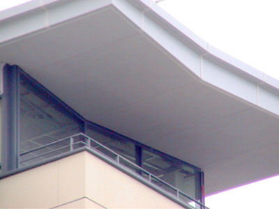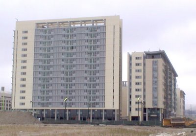
It’s subtle but there is a lot going on here that makes most other butterfly roofs look like blunt interpretations of the definition. Try a google search and you’ll see what I mean. Here the angle is not too great. The tapering thickness refined. There’s just enough asymmetry between one wing and the other to make it interesting. Most butterfly roofs I’ve seen are either so thick or so balanced that they lose any dynamic. Many simply look like the lid of an old trunk flipped up.

Props to Fisher Friedman Associates who worked on this in partnership with Skidmore Owings & Merrill (I won’t link to SOM website. The UI is unnavigable. The search functionality too problematic) 
I would love to know who the individual was that did this. Buried in the team credits there must be one person who lent their own personal sense of proportion and balance to this.
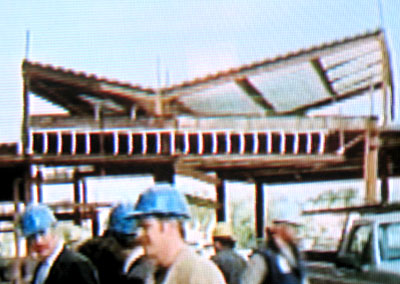
The construction pic is taken from my TV. The roof - in fabrication - showed up amazingly in an episode of Monk (Mr. MONK CAN'T SEE A THING (#501) EPISODE PREMIERE: July 28, 2006)

That’s Captain Leland Stottlemeyer on the left.
The butterfly roof is also part of a very nice larger composition. The designers have created an occupiable space at the top of the building. This old school idea has been dropped from most modern buildings. Rather than terminate in a crisp scale-less sheet of framed glass the designers created a bit of something for the imagination at the top - a place at the top of a building where your eye can rest and wonder what it would be like to be up there. Classical buildings often give me something up top to fantasize about: wondrous views and glamorous people who wander high up on terraces outside glorious and warm rooms. It gives a building some magic. It’s cool that a modern building in the 21st century should pull this out of the bag.